鋼序日常更新
東 和 鋼 鐵 企 業 總 部 服 務 空 間 更 新
Steel Order Daily Update
位置 : 台北 長安東路一段
用途 : 服務空間
位於長安東路的企業總部大樓屹立數十年承載時間的痕跡。在它漫長生命的此刻,我們受託更新後場服務空間 ─
一個看似尋常卻能映照文化與管理的角落。
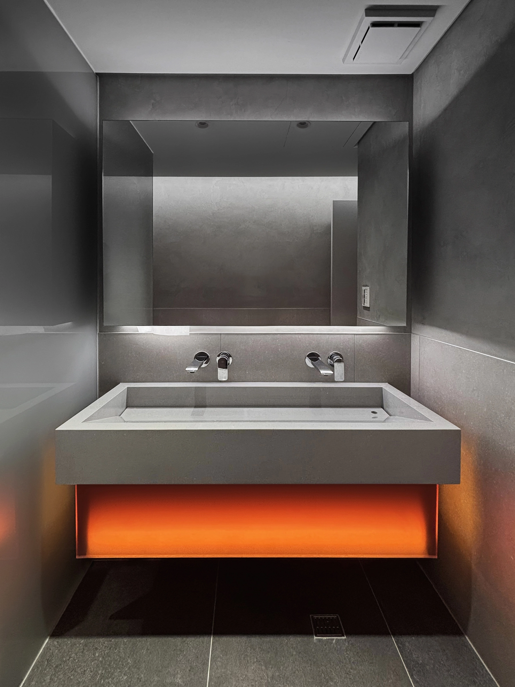
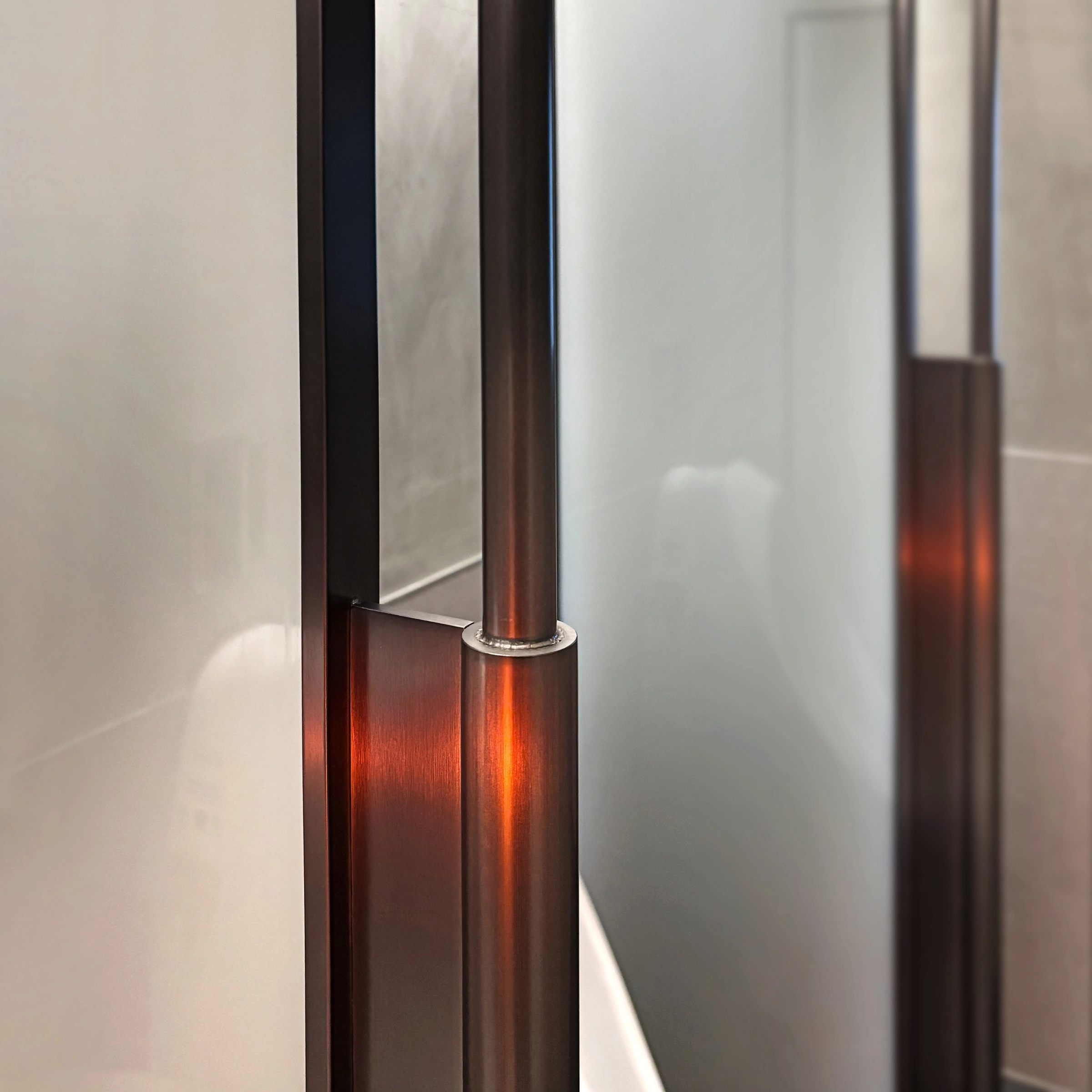
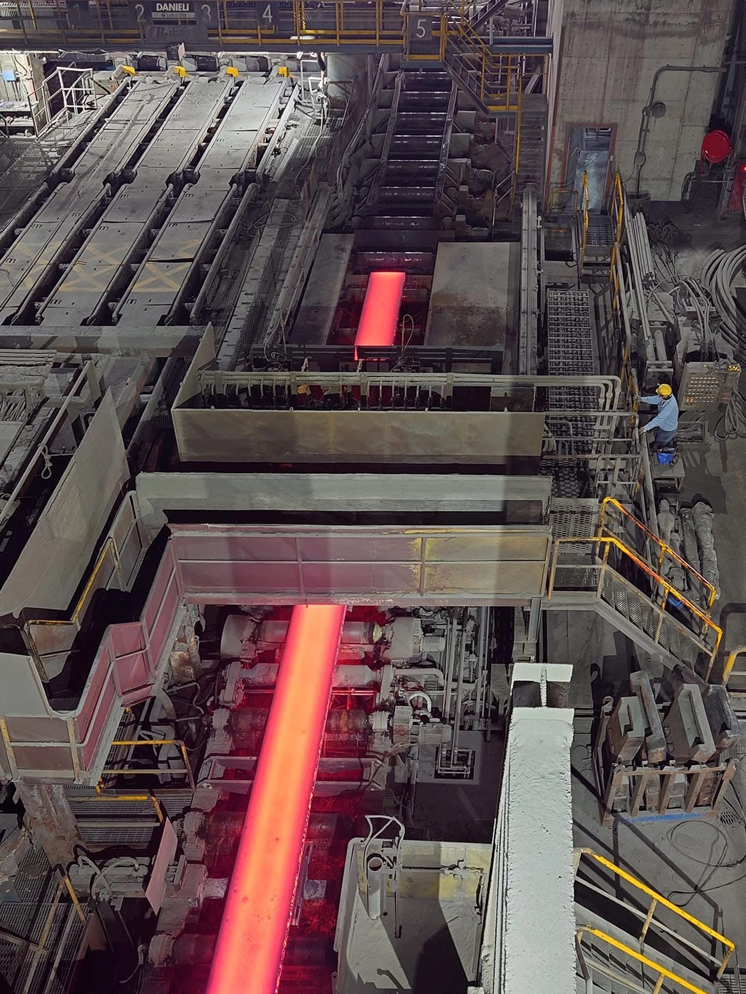
建築背景的董事長夫人在共四個樓層的更新計畫中親自全程參與討論,過程中談到雲林煉鋼廠鋼板在冷卻過程散出桔紅色餘光的物理現象與 OMA ( Rem Koolhaas ) 在舊工廠改造對光與結構的處理。煉鋼廠中的影像紀錄成為設計的隱喻:關於產業的印記、關於能量的轉化、關於時間的流動。不只是改造後場服務空間,而是在有限的現實,為空間疊加留下記憶的層次。
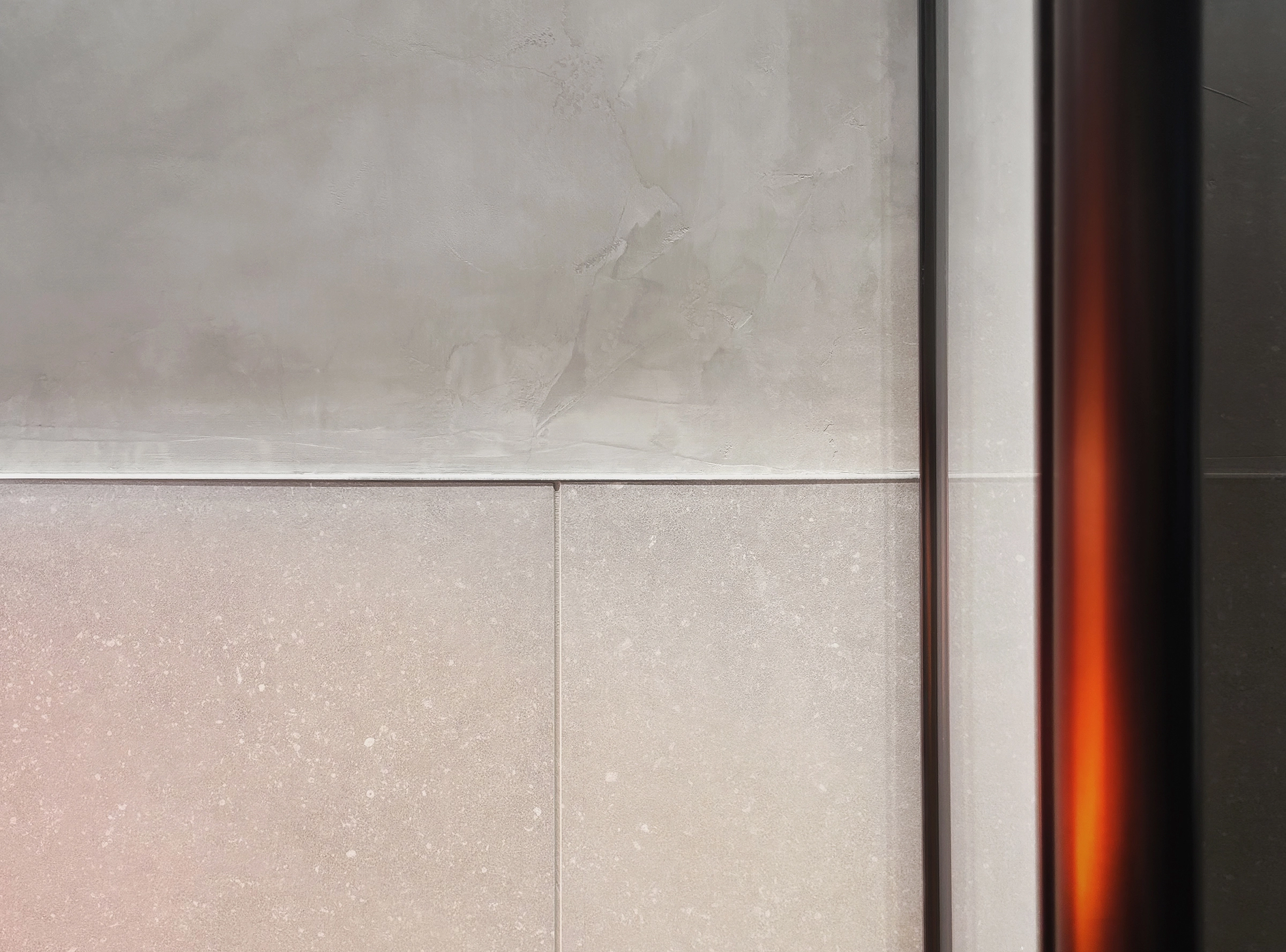
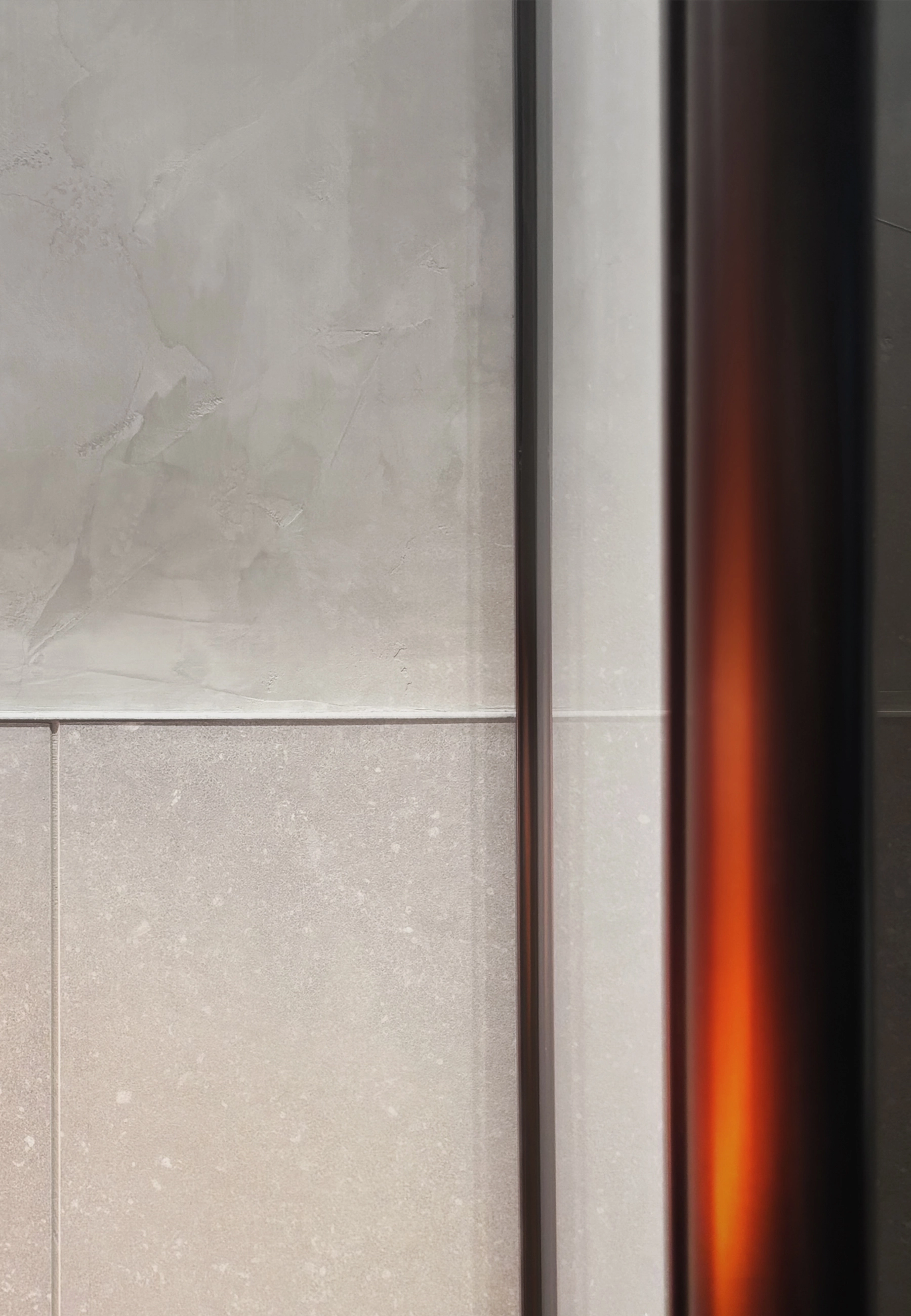
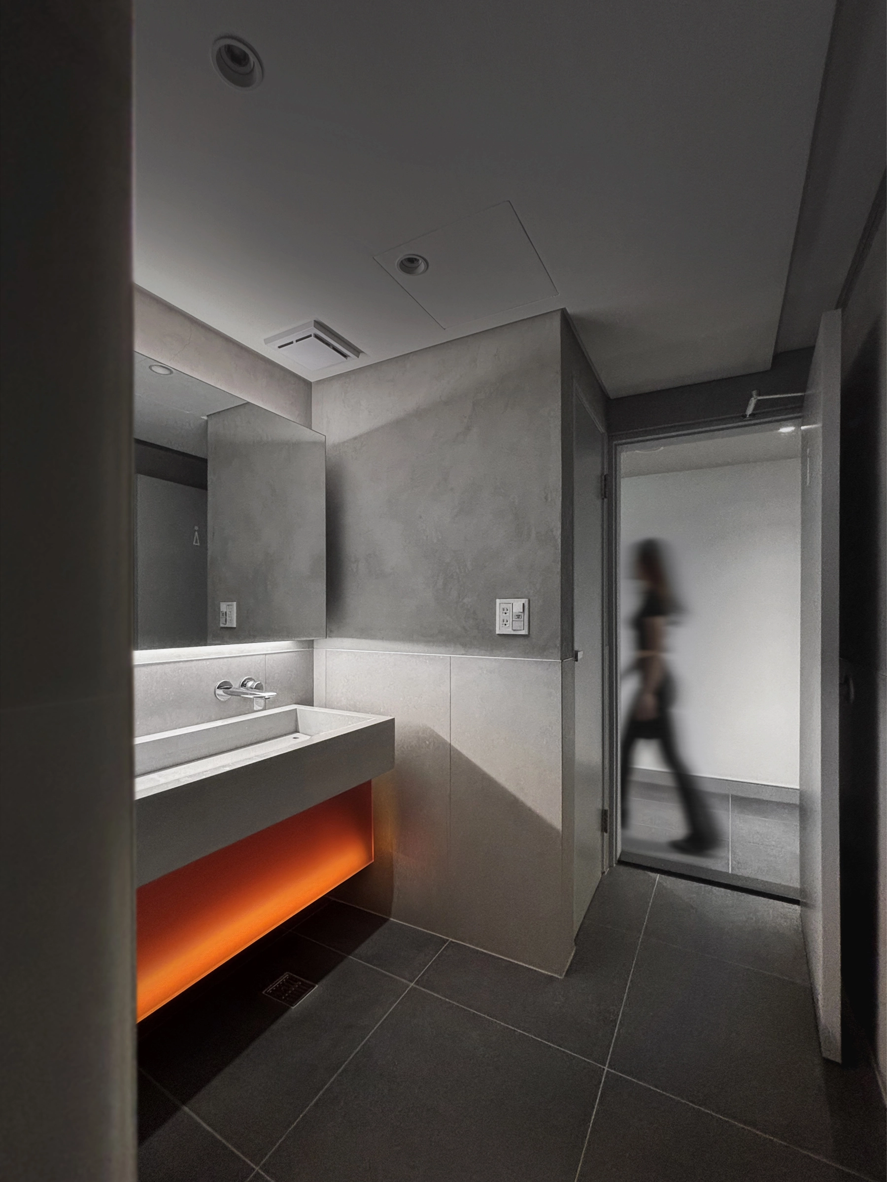
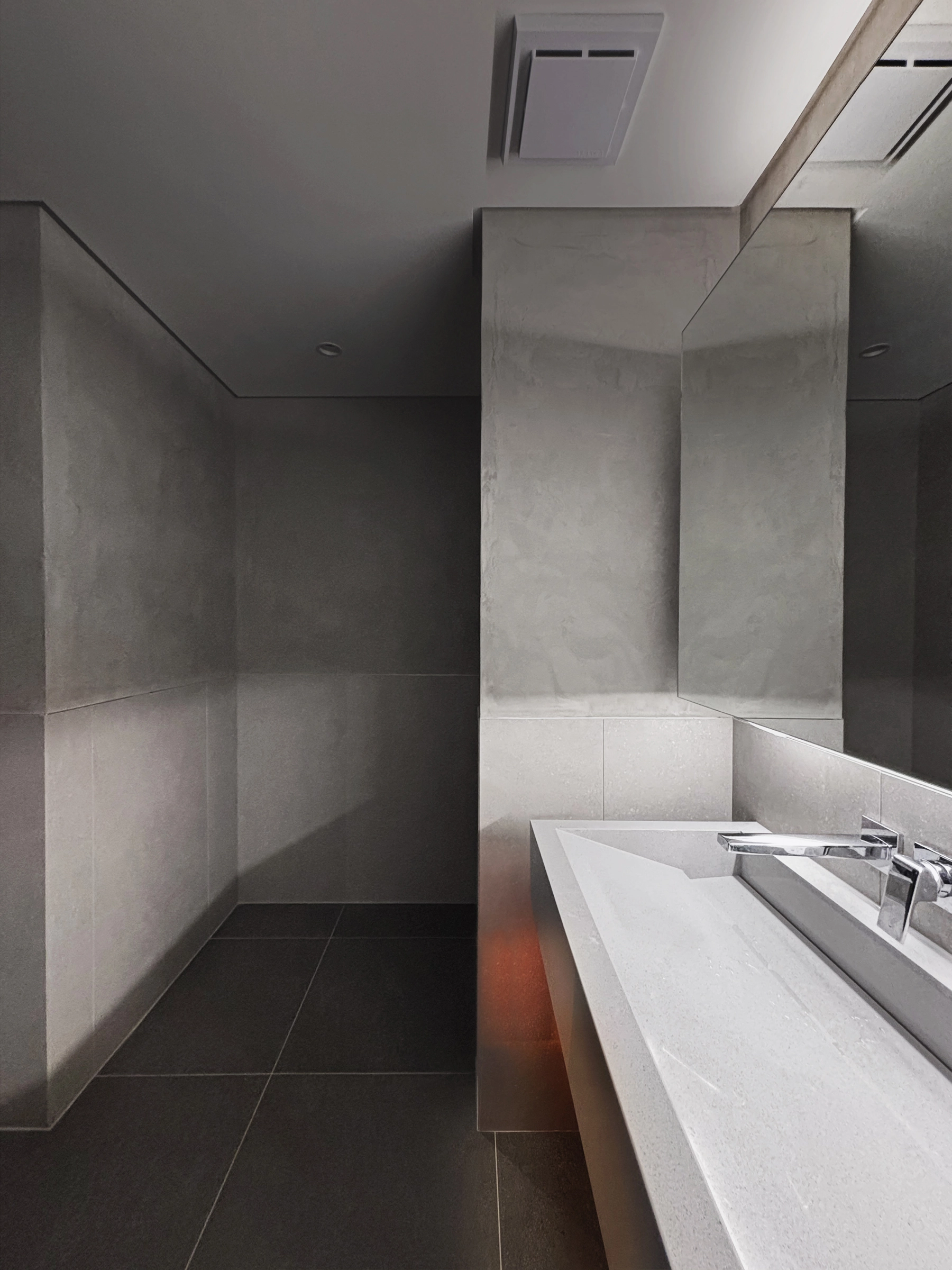
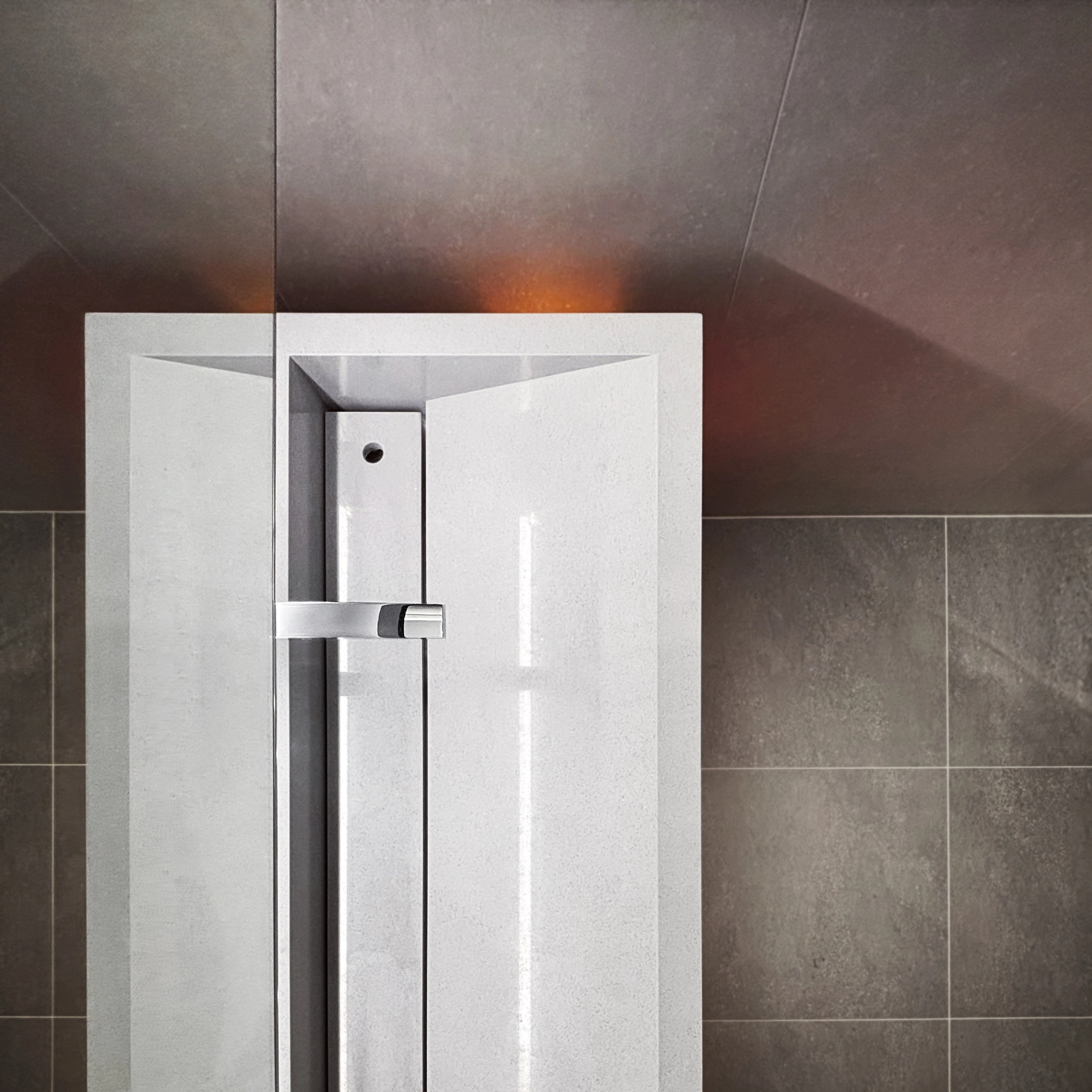
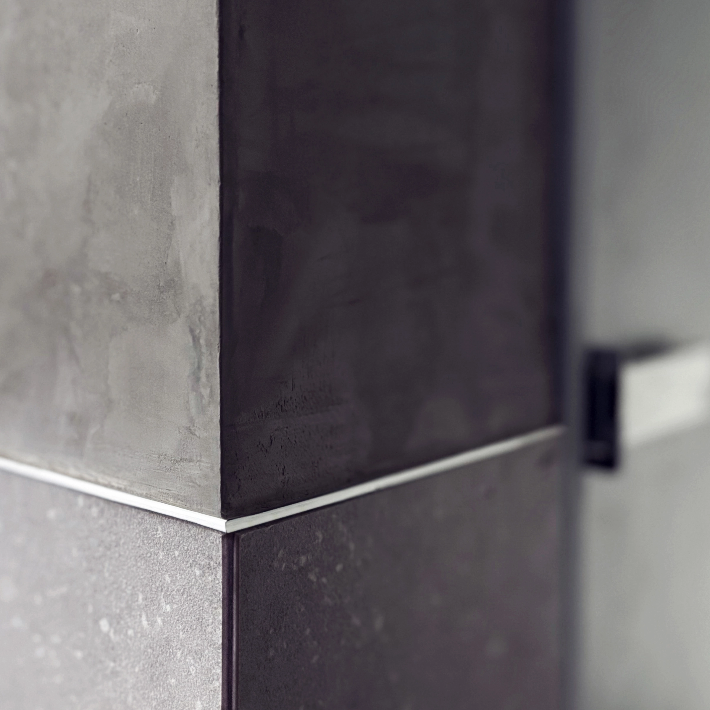
在不更動大幅格局與管線以維持使用者慣性並縮短工程執行歷時的前提下,雙方選擇以「秩序、制度、維護」為主軸:以簡練的裝修層次整頓細部,讓動線與設備更容易管理與保養,也讓多年累積的使用問題逐步消解。灰調石材、混凝質感壁面、鋼材、玻璃搭配深色地坪,讓材料語言刻意收斂,藉由光與材料的本質讓空間呈現洗鍊的態度,呼應企業日常與鋼鐵產業的工業直觀。
這樣的更新目的不在於著眼追求「改頭換面」,而是把既有限制轉為一種態度 ─ 在現實框架裡透過設計審視秩序與傳達價值,也讓空間再一次對齊企業的內在文化精神。
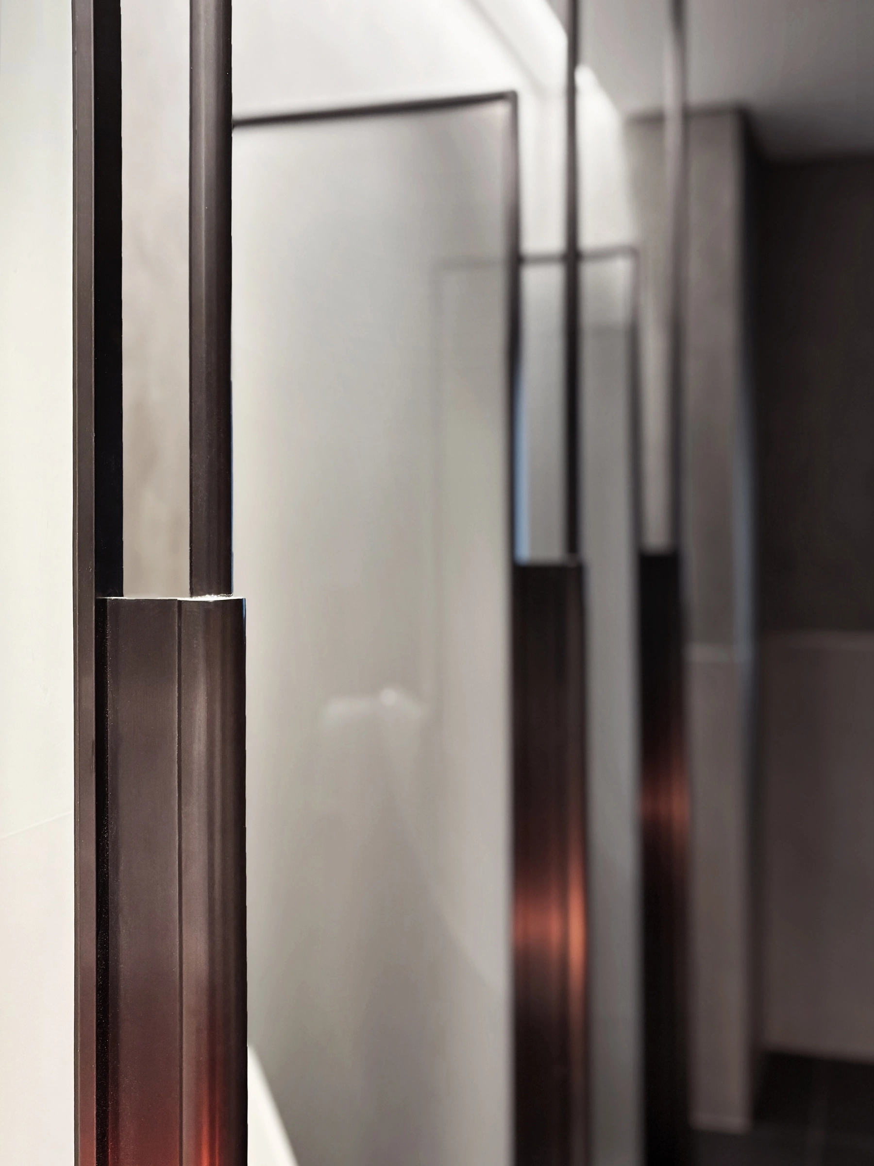
然而我們仍在細節中保留對材料的好奇與試驗:隔間採用膠合玻璃夾灰紙,膠合表面不同的處理在光線下產生層次不一的表情,成為介於開放與隱私之間的微妙界面。這樣的嘗試是乙乙在每次設計裡都希望留下於日常裡測試新的可能的小實驗。
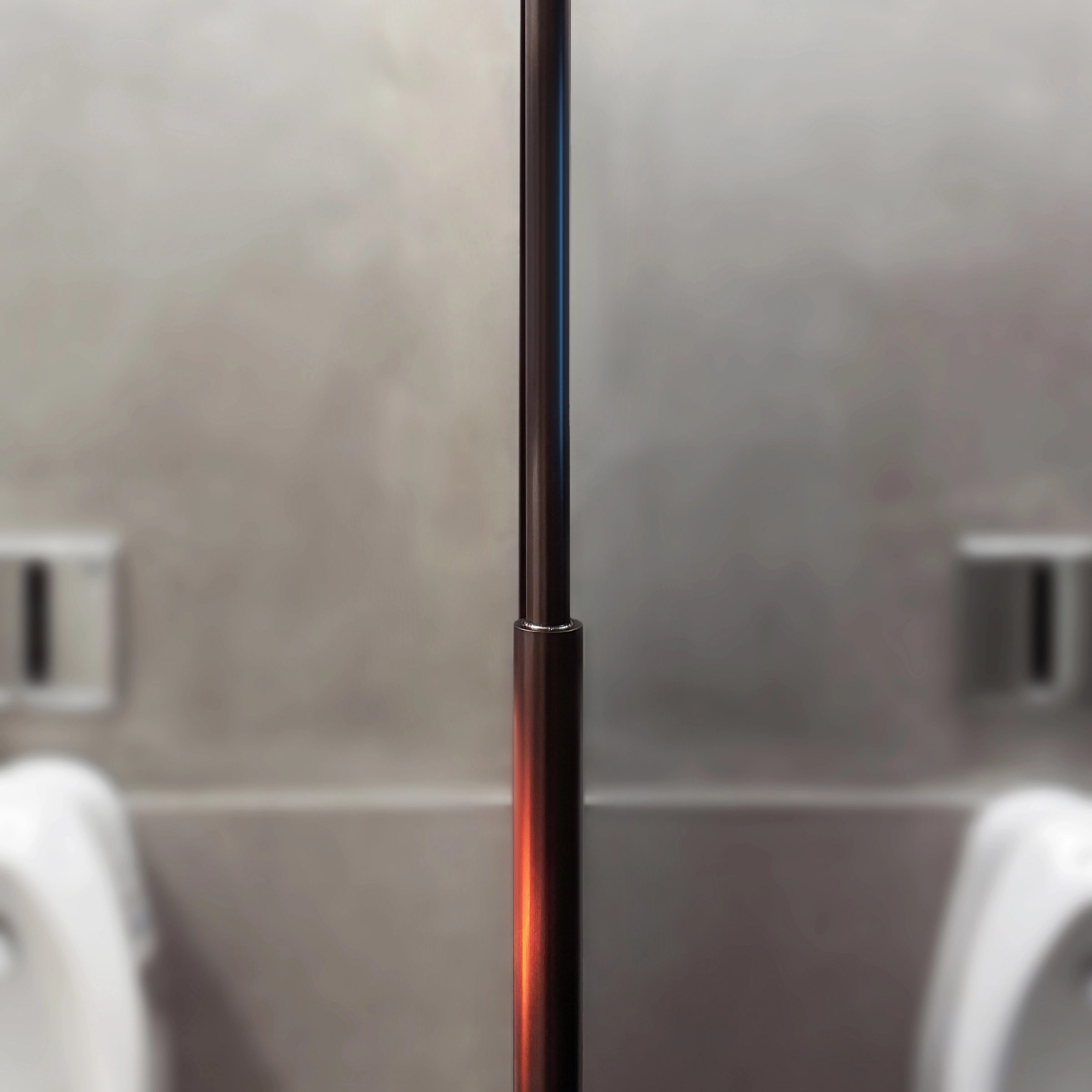
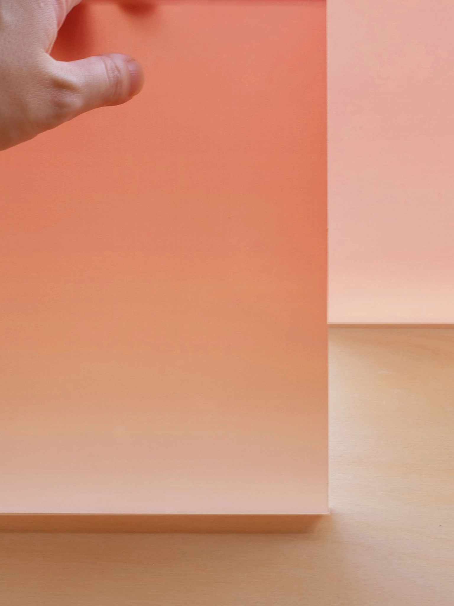
而在收斂的灰階基調中嵌入一抹桔紅色燈帶於洗手台下方,像是被設定為唯一的色彩標記。呼應鋼板冷卻時的光輝,如同一道低調卻堅定的企業徽記,讓日常的後場服務空間,也能在細微處留存一段關於鋼鐵的記憶。